

Email remains one of the most powerful ways to connect with an audience online. This post explores the critical roles that intent, tone, structure, content, and much more all play in shaping positive user experiences.
Why should you care about the user experience of your emails beyond making them just look pretty? We’ll get into that as well!
You Are an Email Spammer Even if You’re Not
You may have your own opt-in list and everything, but that doesn’t matter. The public doesn’t make that distinction.
That’s because the layman definition of spam has evolved from email that’s unsolicited to email that’s irrelevant. This has become such a problem that an article about it was published on one of the world’s leading newspapers.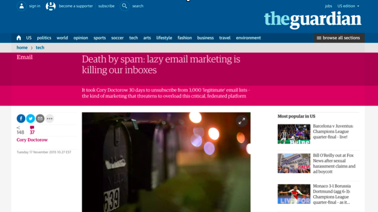
According to a Litmus poll in its 2017 State of Email report, most people delete emails because they feel they are not relevant.
Even if a person opted in to receive emails, they will still use the Gmail “Mark as spam & unsubscribe” button if the emails are too frequent or irrelevant. So you and your domain aren’t safe even if you’ve got a permission-based list.
57% of respondents to a 2016 Litmus poll stated they reported emails as spam
If you are sending unsolicited emails, your odds of getting through to a receptive audience are slim to none. Half of all unsolicited emails are deleted straight away (and likely not without some frustration with the sender).
What about the 50% of undeleted emails? Those aren’t getting through, either. Email service providers (ESPs) are doing a great job filtering out garbage. They know that people are tired of irrelevant email. If a lot of garbage gets through, the ESPs know their customers might go elsewhere.
A Broad and Growing Movement Against Email Noise
People are increasingly frustrated with emails. Movements like Inbox Zero and services like Unroll.me and Gmail Tabs have sprung up to help people deal with their email subscriptions, and to help marketer’s send more effectively.
What is this all in reaction to? Fundamentally, marketers are missing the mark on who their audience is, and it’s pushing their emails into spam territory.
What can you do about it? Below are some guidelines to follow to improve your email campaigns by enhancing user experience.
1. Find and Know Your Audience
Knowing what people are interested in and what they’re expecting from you is at the core of good email user experience (UX).
Audience affects every facet of your email campaign—design, development, and content are all shaped by who you send to.
Audience is THE most important consideration in email design. Here are some example questions to help you get to know your audience:
- Do chunks of your audience have AOL or Comcast addresses? They are more likely to spend money because they are likely older.
- Do you see open rates peak at mid-morning? Then you should optimize your send times to coincide.
- Does your audience read their emails on mobile devices? Then you need to design and build responsive email.
The Legwork is Worth It

Learning about your audience lets you send better email and build your relationship with customers.
If you don’t, you can look foolish. This email from Uniqlo promoting bra tops was sent to a customer that had for years only ever bought men’s clothing. That’s a decent indication that the company isn’t really paying attention to its audience.
Not taking the time to learn about your audience has consequences. At worst, it can make you look unabashedly transparent about caring only about what’s in your customer’s wallet. At best, you look inept.
Is learning about your audience easy? No, but it’s definitely doable and it can really pay off.
Segmented campaigns showed 14% higher open rates, 101% higher click rates, and 9% lower unsubscribe rates.
According to MailChimp’s research, metrics for segmented campaigns improved across the board, showing higher engagement and lower abuse complaints.
These sorts of results suggest a better relationship with your audience that can ultimately translate into more money for your business.
Of course, there’s a bit more to it (isn’t there always?). It’s important to know who your audience is, but you also have to figure out who your brand is, too.
2. Be You, Relentlessly
Before you start emailing your audience, determine what your brand voice is and work hard to maintain that specific attitude.
Your voice—just like design—will help ensure that you stand out in the crowd. Keep in mind, too, that your voice doesn’t have to match what you actually do.
Invent Opportunities to Be Creative
Consider Simple, the Portland-based bank. Banking is serious business, but does the tone of the communication have to be? In the below example, Simple created an opportunity for levity and personality in what would otherwise be a boring, instantly forgettable email: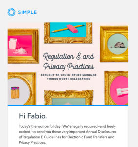
Vanilla Isn't the Only Flavor
Though it might not be a good fit for Simple, irreverence is on the other end of the voice spectrum and can be very effective.
In this classic Cards Against Humanity email campaign to their “horrible friends,” the company humorously asks for five dollars with the promise of nothing in return. Well maybe not nothing. They did build a “giant, pointless hole” with the money...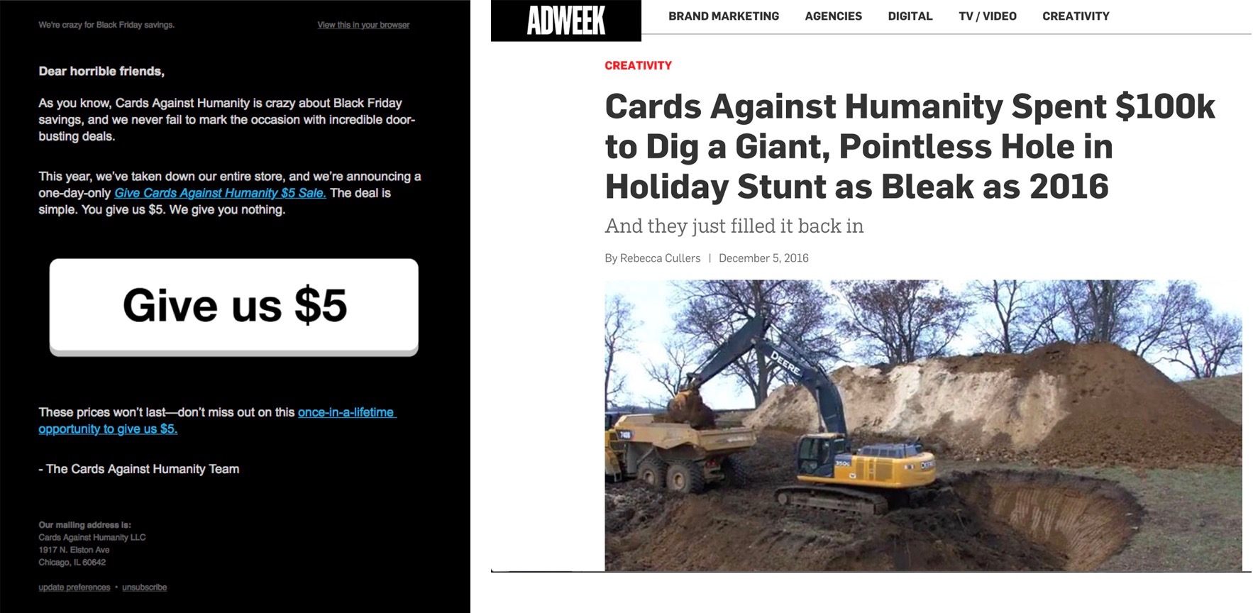
Developing a consistent voice is a critical component of user experience, as it learning how to manage tone.
Match Tone to Audience Needs
For example, a lost password or refund email should have a more serious tone than your newsletter because the subject matter is more serious.
Understanding your customers and their needs can also help drive the tone. For MailChimp users, there’s stress involved with creating campaigns to meet a deadline. As a result, MailChimp attempts to create an empowering experience with supportive and encouraging language.
Then, when it’s time to send (and the hard work is over), MailChimp adds a bit of comic relief with the “Send Now— This is your moment of glory line” followed by a high five from Freddy. The message is short and not over the top, offering up a little humor without overdoing it.
Follow This One Rule Above All
Voice and tone are great, but never forget the most important rule of all:
Never, ever, EVER let your personality override common sense.
To avoid the sort of egregious mistake made by Adidas, bring in others to take a look at what’s going out the door and listen to outsiders.
Not ONE person thought to put a stop to this presumably well-intentioned but insensitive email campaign? Apparently not, and Adidas had to apologize.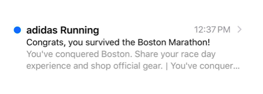
3. Start as a Copycat, Evolve as Yourself
When you’re getting started, there’s nothing wrong with copying something you like. It’s just important to make sure you don’t remain there. If you just keep copying, there’s little opportunity to improve.
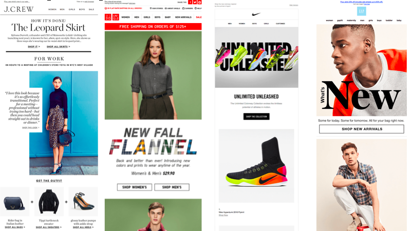
The below examples are all professional and look very similar, but they are also arguably a bit uninspired. They all are using single large images and include a navigation bar. You may disagree, but navigation bars have no place in emails. Emails are not websites!
Ceaseless imitation can lead to state design and stifle innovation. It’s important to try new things and be bold as you develop your personality.
Don’t Be Afraid to Experiment
Experimentation—particularly when it comes to your brand’s look—can be a very scary thing. But looking at designs like the below, it’s difficult to ignore that they tend to be much more visually engaging than the previous examples.
If you want to stand out, you have to be willing to take some risks to reap the benefits. Start out by getting ideas from others, then find your own way!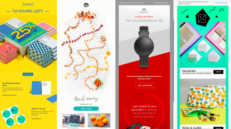
4. A/B Test Beyond the Basics
The benefits of A/B testing subject lines and calls-to-action (CTAs) are well-known, but there are opportunities to extend testing to design, too.
If you’re at the point where your email content is on good, solid ground and you’re getting consistent open and click rates, A/B testing design is where you should explore next.
Practicing the Preach
This sort of experimentation with design can lead to delightful ends and create avenues for progressive enhancement.
When MailChimp’s UX Reader was published, the announcement email included a portion driven by CSS animation. Since older email clients wouldn’t be able to support the technology, the email was built with that in mind. The email’s message was entirely preserved regardless of whether there was client-side support for the CSS animation.
When designing and building emails, you need to strive for graceful degradation.”
Tech progress was made without losing site of user experience for everyone!
5. Don’t Treat Emails Like Websites
Though email design may be web design, emails aren’t websites. There are different design and development considerations that are important to be mindful of and abide by.
Email is a unique medium with some commonality with the web, but make sure you’re aware of some of the key differences:
- In email, tables are used for structure, much like the web back in the early 2000s and some clients require CSS be inlined.
- Web design has to contend with few rendering engines. In email, there are dozens to account for.
- Some email providers don’t load images by default, meaning senders who rely entirely on images can end up sending garbage.
- Some email clients don’t support media queries, making responsive design difficult to achieve—despite most email being mobile.
According to a study by Litmus, 51% of recipients have unsubscribed from lists where emails don’t display well; 43% have marked such emails as spam.
Have Fun!
Though some web conventions may not be possible yet in email, that doesn’t mean email design can’t be exciting.
The Collaborative Fund, for instance, rocks a brutalist design style in their emails: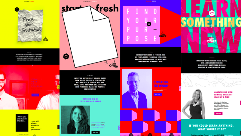
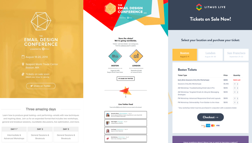
For its part, Litmus, a leading email design and analytics company, has over the years even managed to include background video, a live Twitter feed, and ticket selection in their emails.
Companies like Collaborative Fund and Litmus are pushing the boundaries of email despite the constraints of the medium, and are doing so despite their having to use a more limited toolset of email to achieve their objectives. You don’t have javascript to throw at problems, just HTML, CSS, and your wit. So don’t be deterred, get inspired!
Designing and developing for email means finding simple, yet elegant solutions to problems using limited resources.
6. Be Clear in Focus and Intent
Start with the Focus
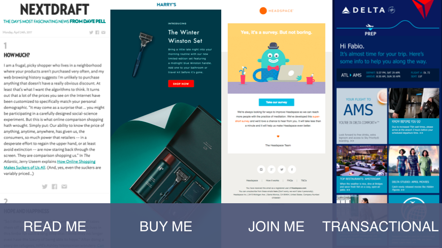
Having a clear goal means you can focus more narrowly on the user experience to build better email. You can approach it broadly at first, since email nicely breaks down into four major categories: Read Me, Buy Me, Join Me, and Transactional.
The first three are one-to-many emails, sent to a list of subscribers. The fourth is one-to-one.
You can blur the lines before the first three a little, but you should make sure to maintain a singular focus for each.
Think about the intent of your email. What do you want the recipient to do once it is delivered?
Determine Intent
Determining intent is the next step in the planning and design process. If you want subscribers to complete a survey, think about what’s necessary for that. Do they need a bribe?
What about if they left items in your store’s shopping cart? If your intent is for them to buy, a reminder email might make sense.
Don’t forget about your subscriber’s intent, either. You want to avoid making it difficult for them to meet your intent.
Even small inconveniences can cost you money. If you, for instance, feature a picture of a dress in an email, then the associated link should go to that particular dress. It should NOT direct to an entire page of dresses. That’s a great recipe for lost sales.
7. Maintain the Experience Beyond Your Email
Email Shouldn’t be considered in a vacuum. The experience doesn’t begin and end in an email that you send. Rather, emails often serve as a bridge between start and end-points of subscribers.
Your email design and content are only part of the picture. How an email transitions to a website is user experience.
Going back to the dress example, if someone selects a dress, bring them to that dress on your website. It’s not a game of “maybe they’ll buy other stuff, too.” Was that the original intent of the subscriber? Play a longer game here then just selling everything you think you can all at once.
Continuing with the transition theme, if an email is responsive, then the website should be responsive, too. And if someone is already a subscriber, don’t throw at pop up modal at them asking them to sign up for emails.
Mind the Medium, and Provide a Name!
Pulling back a bit from what’s in an email and how it transitions to a website, what about how something as simple as the “from” address and name affects user experience?
The name and address should be recognizable, trustworthy, and relevant. It should also make it easy for people to reach out. This is email! If you use Google Play, what happens if you have a question about a subscription? You have to go find some other email address somewhere?
We picked on JCrew earlier, but here they shine. JCrew uses a “from” address that makes sense, and even provides a “reply to” address for easy access to support. Check out the difference: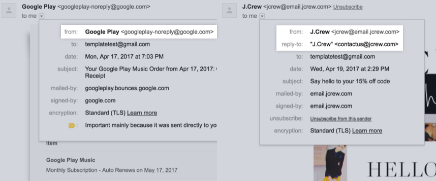
Think Through Your Subject Lines and Preview Text
It seems obvious, but it doesn’t go without saying: your subject lines and preview text matter, and are important aspects of email UX. Both serve to entice readers to open your email and provide you with an opportunity to make a good first impression.
Brooklinen and Cotton Bureau nail it: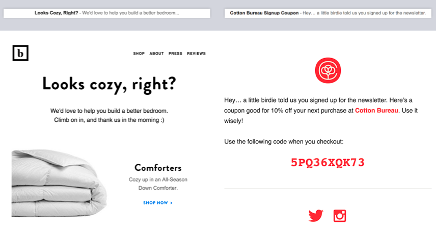
JCrew and Gmail, on the other hand, less so. Who is “style”, and does listing all departments in the preview text make someone want to open the email?
Gmail, on the other hand, is on track but then rather inauthentically expects the user to believe (or suspend belief) that there’s some real “Andy” sitting at Google HQ who’s “so glad” when people sign up?
This seems like a missed opportunity to do something special and make a memorable first impression. So make sure when you’re crafting emails that you’re not being disingenuous, because everyone sees right through it.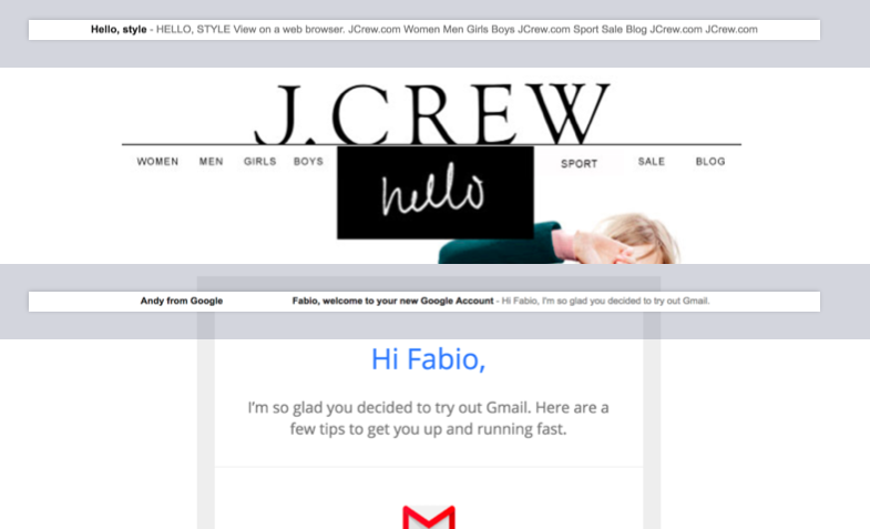
8. Remember Where You Are
Remember where you are when your email lands. It’s easy to forget during the quest for better ROI or the desire to create something kick-ass, that you’re sending email to real, live people. So be personable. Be personal. Be human.
When someone gives you their email, they’re allowing you to enter a space generally reserved for friends and family.
The best marketers keep that in mind.